
While I grew up in the era of streaming services like Spotify, there's something nostalgic, almost romantically in the thought of stopping by a disc shop after work to get myself some new tunes to listen to in the 70's and discovering this new thing people call Heavy Metal music. As a genre that was so out of the ordinary and represented an alternative scene, their albums needed to stand out and be identifiable to metal fans. On the cover you'd find some variation of violent and 'satanic' imagery, but one of the most defining aspects that would draw people in were the logos, massive, barely readable typography that immediately signalled that what you were getting into was loud and unconventional.
Unfortunately there isn't a clear name for this genre of logos. Usually they're labeled as Metal logos, Extreme Metal Logos or addressed by the sub-genre they most likely represent. What counts as such can also sometimes be debated. These logos started gaining traction around 1986 with bands like Samhain, Necrodeath and Mayhem, but have come a long way since then. Nowadays there's an ever-growing number of sub-genres and sub-sub-genres, with each of them appropriating their own aesthetic and logos.
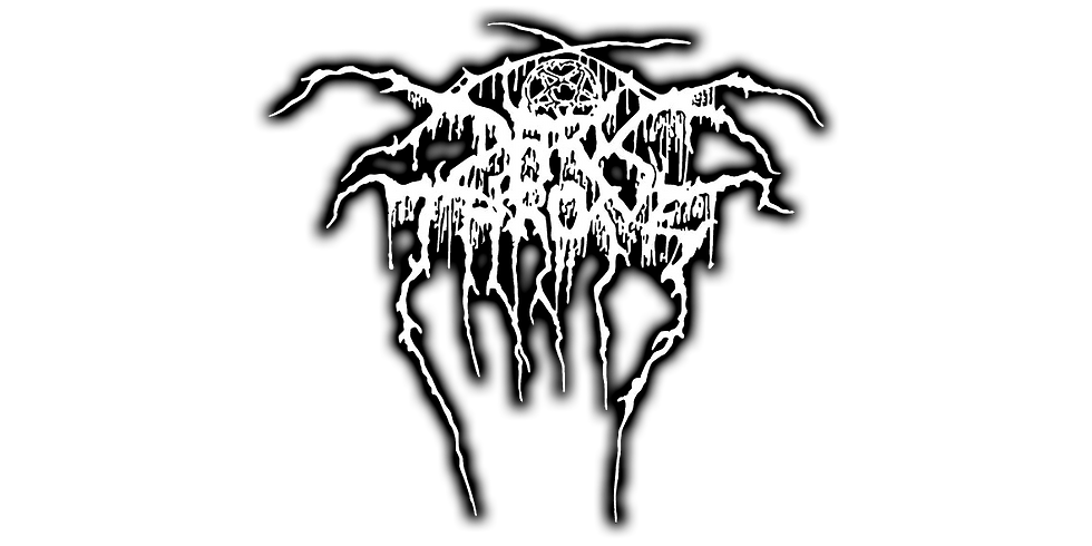
The iconic Darkthrone logo by Tomas Lindberg - One of my all time favorites
I started drawing logos about 4 years ago myself. While I don't claim to be one of the best, I have been asked a bunch of times by different artists that they wanted to learn this form of art and how I started out. Honestly, I still believe the most important part is practice, but it never harms to understand a few basics, which I want to share in this article.

A FEW HELPFUL TIPS FOR NOVICES
There isn't the method to create good logos. Some people prefer doing them on paper, others digitally, and there are as many approaches as there are people doing them. However, it's good to understand a few basics and rules. Once you're proficient enough, you can, of course, break those rules, but here are some tips that I think you should consider when making logos:
NOTE: All of these tips are based on my own personal experience. It's possible that other people have different approaches, but this is how I approach things. This is also not a step by step tutorial and occasionally tips don't apply, but this is just an inspiration.
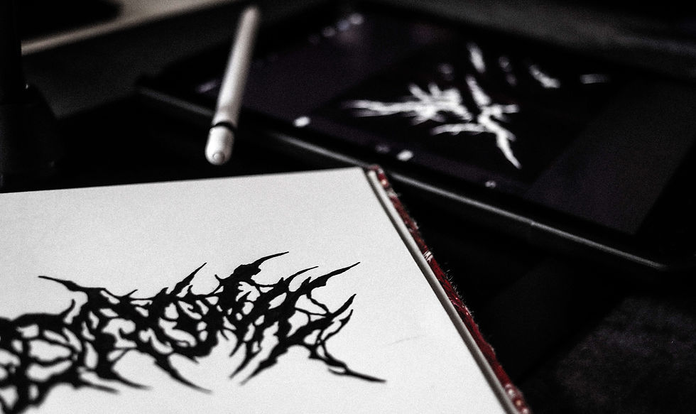
Embrace chaos. Standard typography is probably one of the artforms with the most rules and conventions, but most of these can be ignored here. If your logo consists of only capital letters but you want to throw in a lowercase "a" or "r," go for it! Metal logos require a much more artistic approach than designing a font, so ignore most of what you think you know already. Metal logo designers usually seek randomness, which is difficult to learn at first. Before you get started on any digital medium, I strongly recommend taking out that old-school paper sketchbook and scribbling.
Don't think about it, let your hand do its thing. One thing i like to do is to hold the pencil very losely and doing rash, improvised motions. Don't worry about closing shapes or lose ends yet - the random strokes that you would erase on a drawing can be a great way to figure out what shapes and branches work on your logo. If you work too carefully and you overthink it, your brain is very likely to fall back into the same patterns of shapes you're most comfortable with - a good logo designer seeks that spot where you cross that line of comfort.
I have noticed that if I let my imagination run wild and let the design be completed (I don't get nervous about it), then the best logos are made. In addition, I also think it is important not to sit on a project for days, to try to make a design in one day, regardless of its difficulty, this way we practice even if we have to work well under heavy workload. -Holo Dreamz, logo artist
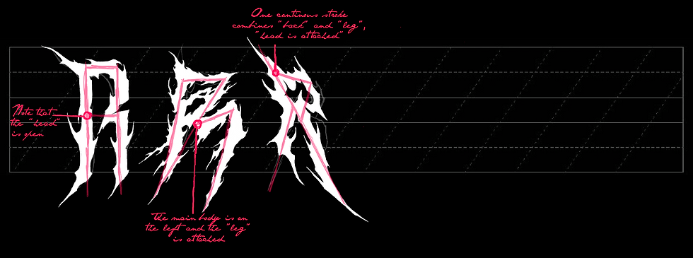
Start by learning to see letters as shapes. A good method is to overlay two (mirrored) letters and try to merge them into one singular shape. It's easy to get caught up with the technical properties of certain letters, but if you look at different typographies, there's a multitude of ways to portray a letter. It's also helpful to draw variations of the same letter multiple times with variations, as seen below.
"A lot of the time metal logos are near unreadable so you want to make sure the shape of the logo is something that draws the eye and encourages other people to ask what the logo says. -Slaughtered, logo artist
Focus on the bare bones of letters first and don't waste your time on ornaments/decorations. You're likely going to want to create intricate shapes, which can cause problems later on because it's much more difficult to edit complex forms. Instead, focus on the letters at hand and make sure not to forget any. It may sound foolish, but it happens more often than I'd like to admit.
I could probably classify as errors the creation of an entire logo based on the wrong sketch, where we might not have noticed a mistake, so we have to work twice as much. By the way, I would also like to mention that I don't think sending every single step to the client is a 100% good solution either, because most of the time, unfortunately, we don't fully understand each other, where we are now in the creation of the design, and they get scared that they won't like it. -Holo Dreamz, logo artist
A great way to practice is to start with a downloaded font and then drawing over and alternating the characters. Here's an example from a personal project of mine where I started with a font and then worked from there on.
Join Me In Death logo by MVSKI. I don't remember the exact name of it but I started by typing out the words in some gothic font.
Consistency is key. This applies to both letters or shapes and negative space. Especially if you're working in a symmetrical way, it's tempting to compromise letter weight and spacing to cram in more letters, which almost always looks poor.
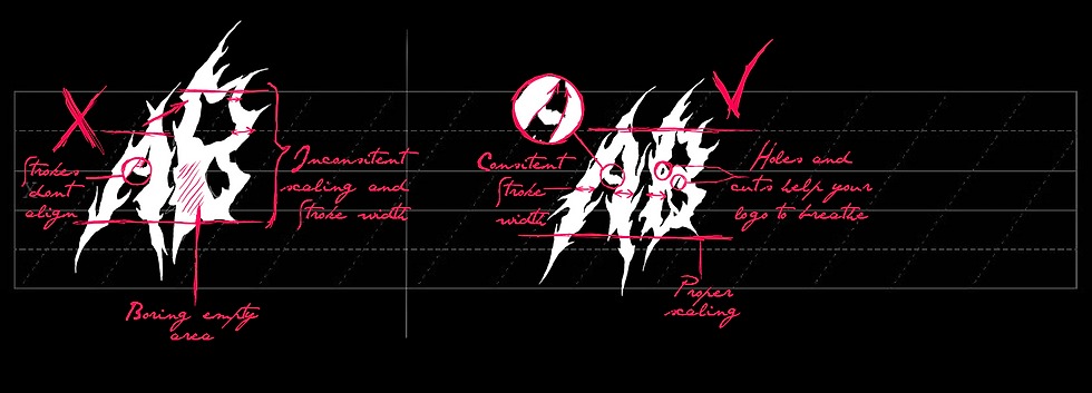
When I'm doing logos the most important thing is to keep in mind the negative space, the empty bits of your logo are just as important as the pen strokes you make. -Slaughtered, logo artist
Especially if you're working on a symmetrical logo, it's important to understand that letters have different weights. That way, you cannot simply divide your canvas by the amount of letters, since it's obvious an "I" does not have the same width as a "W". For me personally, it's helpful to assign numeric values to each character. These can vary depending on your method, but for example, "C", "V", "A" are one character wide. "M" and "W" are 2, a lowercase "t" is 0.5, and an "I" is 0.4. Like I said, these vary slightly depending on how you draw them.
If we take the word "INTERVIEW," the values would amount to 0.5 + 1 + 1 + 1 + 1 + 1 + 0.5 + 2 = 8. The symmetrical center then would be between 4 and 5, so in between “R” and “V”. If we respected only the amount of letters, it would have been between "E" and "R," which is not ideal, since "I" and "W" obviously have different widths. Also, make sure to have uniform spacing and stroke width.

It is also essential to maintain a certain consistency in your style. Don't try to do everything at once, instead do your research and settle on one aesthetic. Every band (or client) has their own style and taste and wants to stand out, and your logo should reflect that. This applies to your own projects as well of course. With this massive emergence of sub-genres, there's a variety of styles of logos that all have their own characteristics.
Death Metal usually goes for a more organic, symmetrical style with intricate branches or spiderwebs, Hardcore uses a lot of street art styles like graffiti, and goregrind takes a very wild approach where legibility is thrown out of the window.
Of course it's not forbidden to mix styles, but especially if you're a beginner I recommend looking into styles and communicate with your client what they envision. It's always helpful to ask for references!
All logos, whether metal or not, should represent those who use them at their best. It doesn't matter if it's a brand, a single artist, or a band. If the logo effectively conveys the vibe and style of the user, the job is well done. Of course, as time passes, artists have discovered various ways to blend styles and reinterpret the metal logo aesthetic. By incorporating graffiti styles, Y2K elements, symbols, or drawings, metal logos are continuously evolving. -Hardgore2000, logo artist
Emphasise the unique characteristics of certain letters to avoid confusing them with others. It's frustrating when people misread your (client's) name because they read a "C" as a "G".
Divide your progress into multiple steps. I usually start with a sketch, then open a new document with said sketch and create a more detailed version. I then open another document and draw a cleaner version, then open another document and redraw it with more details. I repeat that until I'm satisfied. I highly discourage trying to do all of these steps at once, especially if you're working on complex projects.
Finally, dare to stand out. Once you're familiar with the basics, experiment with different looks and discover your own style. Clients and brands always want something unique and will come to you for what only you can provide.
Finally, these are by no means strict rules or steps to follow. Metal logos are a form of art, and as such it's important to put something out that's YOU, that YOU want to make. So don't let these tips intimidate you and feel free to experiment! The most important part is always to practice.
The best way to make a logo stand out might just be adding a personal touch and creating something that distinguishes you from the masses! However, remember that before creating your version of something, you should have a good understanding of what you are reinventing. Study a lot, draw a lot, and respect the art! -Hardgore2000, logo artist
Special thanks to Holo Dreamz, Hardgore2000 and Slaughtered for contributing!
HOLO DREAMZ
Comentarios